Project
Making of the portfolio website

Inception :P

Project Overview
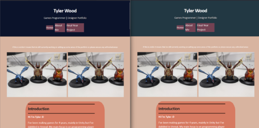
You may have noticed but this portfolio has a very unique layout but it did not start out this way. I started with a free online website builder but quickly ran out of free elements to add so I looked into making my own website from scratch and basic Jekyll themes for github pages.
However I never found the templates I was using that appealing and struggled to get a style that I wanted so I started working on the Windows theme that is now in place.
This was my first time using HTML/CSS and github pages and I found it to be a very different workflow than what I was used to with Unity and C# but once everything started to come together I now have a lot of fun working on it and adding new projects.
Skills Used
- HTML
- CSS
- Github Pages
- Web Design
Old Web Screenshot
Why Windows 95?
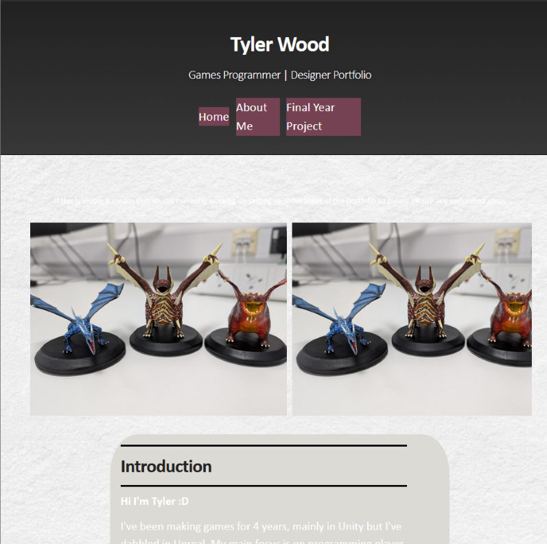
When I started making the website I used the Jekyll Slate theme, it was very minimalistic but I found it lacked personality.
I thought for a while about different themes I wanted, I started with just changing the colour pallets for the theme which did look better but I had the same feeling of wanting something more unique.
In one of my UI design classes in university my lecturer had mentioned a past student who did UI for a game based on a Windows theme, I remembered this and got inspired to do a similar theme for my portfolio as it gave me a lot of freedom to add new features and change the look.
It was mainly the appeal of adding new optional features that I plan to do in the future such as adding backgrounds, sound effects and more. While these could be done with any theme working with a layout that people already know gives justification. I was also drawn to this idea through the general aesthetic of old Windows UI as it make myself and other nostalgic for a time when computers and websites weren't focused on minimalism and simplicity.
Development
Getting the website up was easier than I originally expected but having the elements line up as I wanted them to took a while to understand. In the beginning I had to keep a diagram of the difference between margin vs padding open whenever I was tweaking elements,
but once I had the main page looking how I wanted it to I was able to start on adding my projects to it.
I started with wanting a very basic home page that had only the introduction and you would be able to navigate to the projects through the start menu but after getting feedback and having issues implementing the start menu I added the projects to the home page so it was easier to find, especially for mobile users.
I have had a lot of issues when adjusting my website for mobile use which is one of the downsides to not using a template but through building it manually I have gotten familiar with HTML and when bugs do arise I now rarely need to search online for answers.
Old Web Screenshot